General

Website rebranding 20/04/2021

The new aesthetic is nice but it is very glitchy on mobile. It is difficult to navigate the site because site elements overlap each other nonstop and make it difficult to read and/or click anything. I don’t think this is intentional. If the site can return to being functional then I’d have no problem with the update as far as I can tell, and I appreciate the hard work, but right now I don’t like the new design at all because it has broken the website.
4 years

Website rebranding 20/04/2021

finickyfeedee:
The new aesthetic is nice but it is very glitchy on mobile. It is difficult to navigate the site because site elements overlap each other nonstop and make it difficult to read and/or click anything. I don’t think this is intentional. If the site can return to being functional then I’d have no problem with the update as far as I can tell, and I appreciate the hard work, but right now I don’t like the new design at all because it has broken the website.


A temporary fix is to refresh the page. But yes this is a bug I'm having problems with to. Hope they find a fix soon.
4 years

Website rebranding 20/04/2021

MissRohi:
Allowing to see the profile pictures of members and their user names without the need to sign in, is a major breach of privacy, in my opinion, and I strongly disapprove!

Only members should be able to see those ONCE THEY SIGN IN!


Hi, thank you for your feedback. We completely understand the want for privacy. We have just this morning built a function for you to hide your content / profile so it does not appear on the home page.

If you would like to hide your account from being shown on the home page. Please follow these steps:

1. Click on your avatar and select 'My Account' form the drop down menu.
2. Select 'Settings' from the 3 tabs at the top of this page. This is the third tab after ' My Account' and 'Blocked Users'.
3. On the settings page, under the 'Privacy' subheading. There is now an option to hide content from the home page. Simply select this and press save.

Thank you
4 years

Website rebranding 20/04/2021

This is me zoomed out to 70% to see the top and bottom of the chat frame. As you can see the usernames and details become pretty small and definitely not easy to read. I would prefer to see less people on the list and have the text and avatars a bit bigger. As others have already said: at 100% you can't fit both the top tabs and the dialogue box in the window.
Also The yellow bar with white text means the usernames are unreadable, which is a problem for incoming chats.
Non-chat related: I was sad to see that the drop down options for profiles has gone. It was a relatively new feature to be able to drop-down select what kind of profiles you wanted to view. Instead of profiles>search>choose>select.
4 years

Website rebranding 20/04/2021

finickyfeedee:
The new aesthetic is nice but it is very glitchy on mobile. It is difficult to navigate the site because site elements overlap each other nonstop and make it difficult to read and/or click anything. I don’t think this is intentional. If the site can return to being functional then I’d have no problem with the update as far as I can tell, and I appreciate the hard work, but right now I don’t like the new design at all because it has broken the website.

MustBecomegluttonous:
A temporary fix is to refresh the page. But yes this is a bug I'm having problems with to. Hope they find a fix soon.


You may need to hard refresh your browser, or clear your mobile cache. It will clear eventually anyway but doing it manually will speed things up.

On PC or laptop when viewing the website press Ctrl + F5. Clearing the cache on mobile depends on your browser and device, but some instructions for popular models can be found in the following link: sleeplessmedia.com/2016/04/20/how-to-hard-refresh-on-a-mobile-device/.
4 years

Website rebranding 20/04/2021

Just an update, please note the issue with the story upload in the earners section has now been resolved and is now working as usual!

Thanks!

c00kie
FF Team
4 years

Website rebranding 20/04/2021

New layout is cool. Dark mode is awesome. Thank you FF Team.
4 years

Website rebranding 20/04/2021

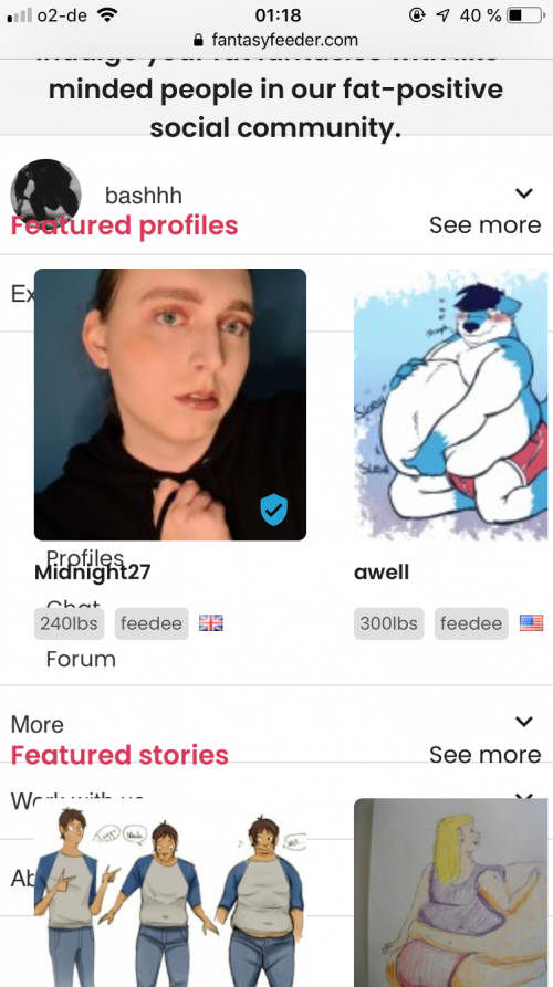
Hi guys, so yeah on mobile the website is unusable basically.
Scroll down menu overlaps on the main page, like all the div are on top of one another. As I’m typing this there’s a big red FANTASY FEEDER in the text box, hiding parts of what I’m typing.
I feel it could be an issue of responsivity? Although it doesn’t help for me to refresh the page anyways.
4 years

Website rebranding 20/04/2021

bashhh:
Hi guys, so yeah on mobile the website is unusable basically.
Scroll down menu overlaps on the main page, like all the div are on top of one another. As I’m typing this there’s a big red FANTASY FEEDER in the text box, hiding parts of what I’m typing.
I feel it could be an issue of responsivity? Although it doesn’t help for me to refresh the page anyways.


I haven't had that on my device, what are you using, if the viewport size is an issue the dev will have to look at their grid and figure it out.

I did have a similarish issue though where the box containing the core text on a profile seems to not flex to my screen on a note20 running chrome.

I'm guessing there's a lot of bedding in to be done especially on android
4 years

Website rebranding 20/04/2021

bashhh:
Hi guys, so yeah on mobile the website is unusable basically.
Scroll down menu overlaps on the main page, like all the div are on top of one another. As I’m typing this there’s a big red FANTASY FEEDER in the text box, hiding parts of what I’m typing.
I feel it could be an issue of responsivity? Although it doesn’t help for me to refresh the page anyways.

LondonFA:
I haven't had that on my device, what are you using, if the viewport size is an issue the dev will have to look at their grid and figure it out.

I did have a similarish issue though where the box containing the core text on a profile seems to not flex to my screen on a note20 running chrome.

I'm guessing there's a lot of bedding in to be done especially on android


I’m on iOS 12.5.1, and my display is rather small : it’s an iPhone 6S.

Here’s a screenshots of what it looks like for me
4 years
attachment
1234   loading