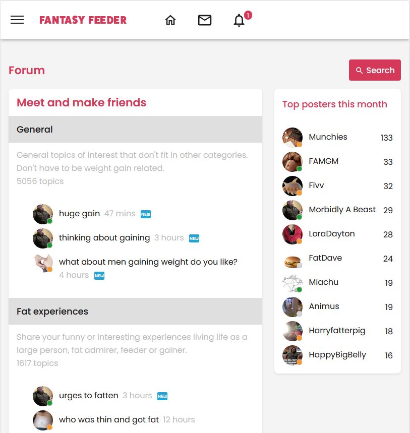
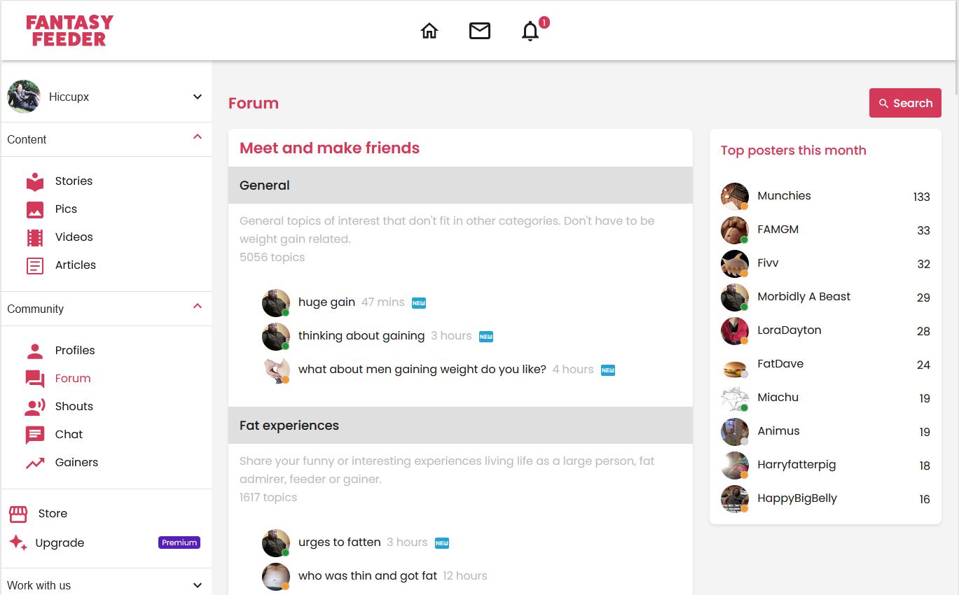
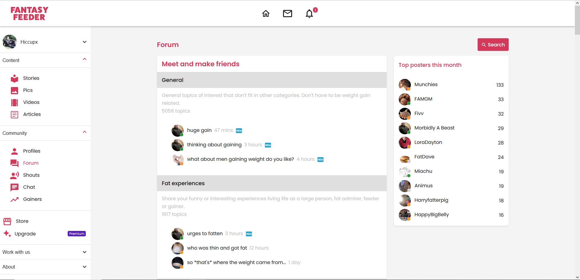
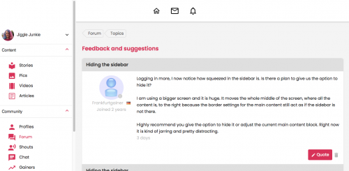
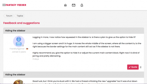
Logging in more, I now notice how squeezed in the sidebar is. Is there a plan to give us the option to hide it?
I am using a bigger screen and it is huge. It moves the whole middle of the screen, where all the content is, to the right because the border settings for the main content still act as if the sidebar is not there.
Highly recommend you give the option to hide it or adjust the current main content block. Right now it is kind of jarring and pretty distracting.
3 years


