Feedback and suggestions

Updates to story formatting

There are a few things that I think the FF story interface does REALLY well - the ability to edit chapters easily, ability to insert chapters, deleting stories at the top of the list.

There are other formatting issues that could added though, which would be amazing.

1) simple formatting like italics, bold, l/c/r justification
2) font size and color
3) maybe some bbcode functionality like /quote?

This is probably not going to happen, but removing the minimum chapter size would be good. But it’s probably an anti spam thing.

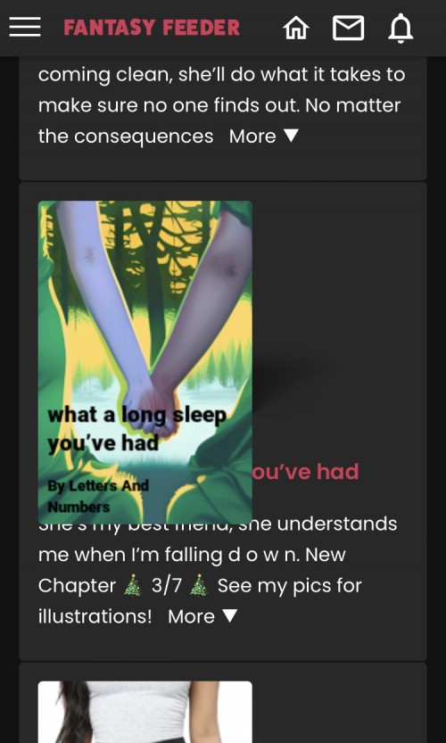
Also, on mobile the cover picture of the story covers up the name of the story.

And it would be great to be able to use capital letters in story titles!

Thanks.
1 year

Updates to story formatting

Thanks for your suggestions. Some of these we are intending to do and others not.

For regular stories, we may introduce itallic text and perhaps centeral alignment, but not color, bold etc. This is to keep formatting in line with regular published novels where it's the story telling that is most important.

If we introduce the ability to create picture books then a lot more formatting options would be available.

Regarding the title text covering the tumbnail, we're considering making this optional as least for premium authors. Then you would be able to create your own cover with the title and author's name already in the image.
1 year

Updates to story formatting

Hiccupx:
Thanks for your suggestions. Some of these we are intending to do and others not.

For regular stories, we may introduce itallic text and perhaps centeral alignment, but not color, bold etc. This is to keep formatting in line with regular published novels where it's the story telling that is most important.

If we introduce the ability to create picture books then a lot more formatting options would be available.

Regarding the title text covering the tumbnail, we're considering making this optional as least for premium authors. Then you would be able to create your own cover with the title and author's name already in the image.


Ok, that’s great. You might want to reconsider bold and color. I think you’ll find that many published novels make use of them. Particularly boldface and underline. Those aren’t uncommon at all (underline is proper formatting for names of books, etc). Giving storytellers a full toolbox allows for more creative storytelling.

For the title text, I meant that if you are looking at the stories on a mobile device, the cover picture covers up the name of the story. Maybe it’s just an iOS thing, but you should check it. I can show a picture if you like. This isn’t a problem on desktop.
1 year
attachment

Updates to story formatting

Hiccupx:

For regular stories, we may introduce itallic text and perhaps centeral alignment, but not color, bold etc. This is to keep formatting in line with regular published novels where it's the story telling that is most important.


One other point on this and I’ll shut up, and it’s just a philosophical one, not at all a complaint:

If I’m going to read a novel, I want to read it on paper (or a kindle) where I can bookmark it and thumb through and, often, see the illustrations, and it’s a pleasant and comfortable reading experience. If I’m going to read a short story, it might be in a book, or it might be in a magazine with color pictures and more complicated desktop publishing. My first choice to read a novel, though, would not be on a website. For example, on this website, you can’t bookmark and pick up where you left off and you can only skip chapters 5 at a time. For a 100 chapter book, that can be tough. And it’s still great to read stories here because of the creative community, but it’s fundamentally reading a book on a website, not on paper.

HOWEVER…. It’s a website! There’s so much that you can do on a website that you can’t do on the printed page. I would embrace that! It would be up to the author to use multimedia tastefully and effectively, but that’s no different from words (there are plenty of stories on this site and others that are not everyone’s taste!). That’s the power of a website, though. A horror story that has some spooky illustrations, but one’s a gif and it’s a jump scare. A link to a YouTube page with a soundtrack. A convincing mock-up of a texting conversation (my most recent chapter has this and the version I have to put on FF is not very convincing!). There are a million things possible that utilize the format to make a story more immersive.

I really don’t think that this is common on other creative fiction sites, either (at least not erotica). I think most stick to traditional print tropes. Giving the creative people here a big toolbox would set FF apart from the others.

And already, FF offers things that other erotica lit websites don’t. I use my Pics page to store illustrations. I could do videos, too, if I wanted. Or even use the gainers section to track my characters, or something like that. The options are there. But it’s in the nature of this website to want more, right? Let’s keep growing.
1 year

Updates to story formatting

The formatting problem for story image/title is fixed now! Thanks!
1 year

Updates to story formatting

Bumping this thread instead of a really old one - is there a way to fix the chapter selection mechanic in a story? Instead of clicking the story and then having to scroll to the bottom and having the 2,3,4,5>> option (which is horrible if there are 50 chapters and you want to get to 25), maybe there could be a drop-down at the top of each page, or even a Table of Contents page with links to every chapter?
1 year

Updates to story formatting

Hi Letters And Numbers,

Thanks for the suggestion. A table of contents is something we have considered introducing to the story section to make it easier for readers to navigate to chapters they want to read.

I will poke hiccupx about this one, as it may be on the to do list. We tend to go round the site and do improvements on each section in turn. So it could be the next time we work on stories this may be something we will add.

Cheers.
c00kie
FF Team
1 year

Updates to story formatting

FF Team:
Hi Letters And Numbers,

Thanks for the suggestion. A table of contents is something we have considered introducing to the story section to make it easier for readers to navigate to chapters they want to read.

I will poke hiccupx about this one, as it may be on the to do list. We tend to go round the site and do improvements on each section in turn. So it could be the next time we work on stories this may be something we will add.

Cheers.
c00kie
FF Team


Thanks c00kie!
1 year

Updates to story formatting

Some more feedback/a suggestion: when someone you’re following posts a new chapter in a story, it shows up in your feed with a little snippet of the new chapter, but when you click on that it always takes you to the first chapter of the story. It would be nice if it took you directly to the new chapter.
1 year

Updates to story formatting

Ok, 10 months later, are there any thoughts on some improvement to the story formatting, particularly the chapter navigation? The bug with chapter notifications in the Shouts feed is still happening, too.
8 months
12   loading