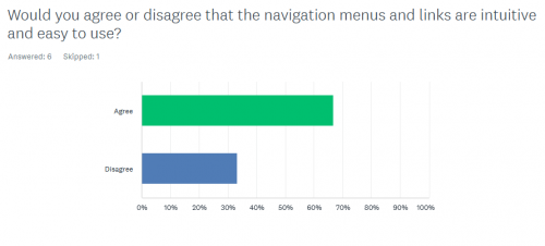
I think most people on the site hate the current desktop version of FF, but we learned to live with it.
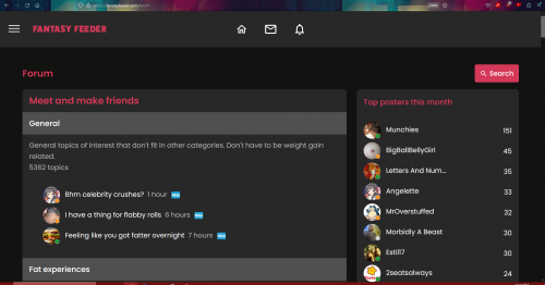
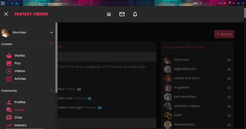
However, I discovered another way to experience the site better -increasing the page size to 150%. Doing so eliminates all the negative space and triggers the side menu to do what it does on mobile.
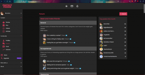
Here are some screenshots I took with the scale at 100%, 150% without the menu, and 150% with the menu respectively. My proposal would be to make the 150% the default look.
2 years


